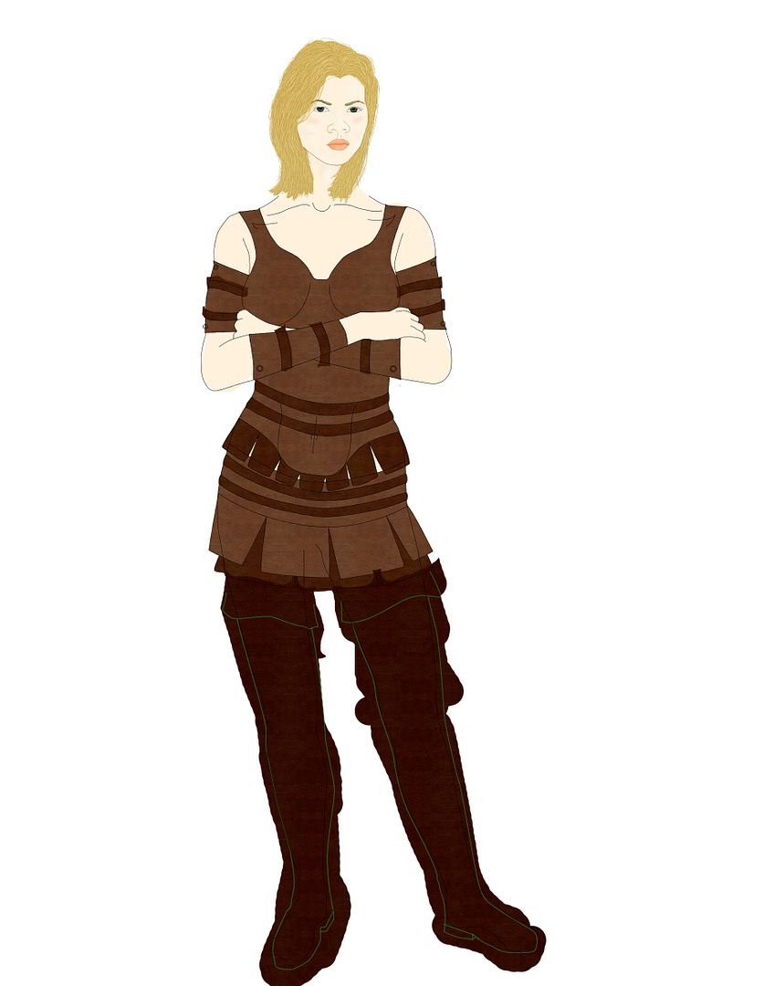
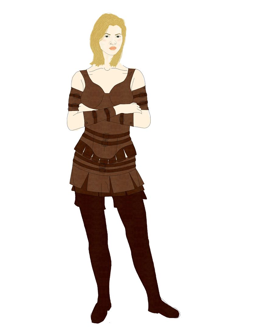
Judith Full Body
It's huge, I'm too lazy to shrink it AND save it as a Jpg. It's taking a while, yet it's getting there.
But does anyone see anything in the outline that they might point out for me to fix? Or anything? The sooner things are caught the better..
I'm having so much fun drawing this. It should be finished after I have two more mostly-free days.
__________________________________________________
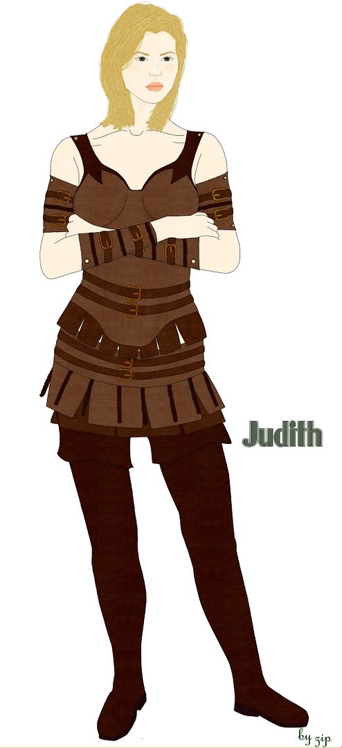
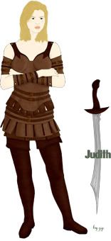
Finished Piece
(At least I think it's finished)
My First Full Body Art Thing (Updated with finished piece)
14 posts
• Page 1 of 1
My First Full Body Art Thing (Updated with finished piece)
![]() by zipcat » September 10th, 2007, 12:34 am
by zipcat » September 10th, 2007, 12:34 am
Last edited by zipcat on September 11th, 2007, 10:06 pm, edited 2 times in total.


-

zipcat - Clan Member
- Posts: 1021
- Joined: July 4th, 2006, 1:09 pm


![]() by zipcat » September 10th, 2007, 2:35 am
by zipcat » September 10th, 2007, 2:35 am
Haha, yeah, you're right, I should fix that.
______________________________________
I'll fix it last.
But I've gone further.. I'm also going to fix her nose.
Ugh, she's got buckles now.
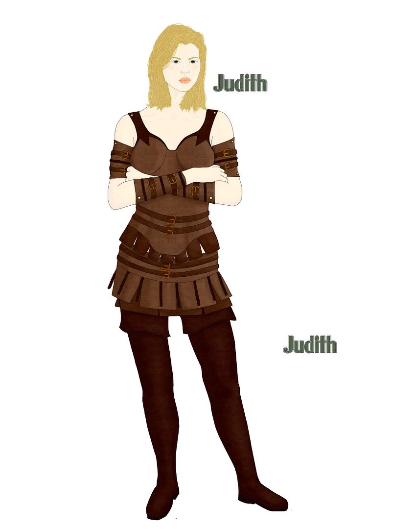
Judith
______________________________________
Yay it's getting there! Haha.
About 80% Done
______________________________________
I'll fix it last.
But I've gone further.. I'm also going to fix her nose.
Ugh, she's got buckles now.
Judith
______________________________________
Yay it's getting there! Haha.
About 80% Done
-
zipcat - Clan Member
- Posts: 1021
- Joined: July 4th, 2006, 1:09 pm
![]() by jadewik » September 11th, 2007, 7:54 pm
by jadewik » September 11th, 2007, 7:54 pm
Wow! Great job, zip.
To my wearied eyes (I haven't been sleeping well) it looks like her neck is a hair long-- it's just long enough where it doesn't quite look attached to her body. Everything else has fantastic proportions! I like her stand-off-ish pose and the way you have her hips cocked. The hands are drawn well-- though I have noticed you tend not to draw hands in your art. They can be VERY expressive if you do draw them. The armour and the detail on the armour is great! I love it!
I want to see more! =)
-

jadewik - Clan Webmaster
- Posts: 1206
- Joined: August 5th, 2005, 1:54 am
![]() by zipcat » September 11th, 2007, 10:10 pm
by zipcat » September 11th, 2007, 10:10 pm
Haha, thanks!
I started off with the head already done from a previous drawing, and put the body to it. I've connected them now with this last update. Think they're close enough together now?
Yeah, this is the first time I've drawn hands, so thanks; I'm glad they came out like they did. And thanks again
Lets see, I fixed her nose and everything.. so I think it's done. Yay. I'm thinking about adding some small (about two inch) squares of leather hanging off over just the top of her shoulders, but I dunno.
More? Haha, eventually.
I'm going to find someplace that'll print it out on poster paper for me.
-
zipcat - Clan Member
- Posts: 1021
- Joined: July 4th, 2006, 1:09 pm
![]() by jadewik » September 12th, 2007, 2:41 pm
by jadewik » September 12th, 2007, 2:41 pm
Her clavical (collar bone) is very prominent-- not a bad thing, but you can use line weight and/or shading to accomplish the illusion of the bone being there. (I admit this is something I haven't quite mastered m'self). Her collar bone also a little bit too high, I think.... if you get a chance, take a peek in a mirror and see where that lines up. Your drawing looks like it's slightly above the shoulders and sloping up. I think (I can't tell sitting at my desk feeling my collar bone)... that it slopes downward towards the center.
The other thing I noticed is the shoulders are so... thin. The line denoting the arm (above the arm band) goes up a little too high-- it should end just a little past the arm band. If you draw a circle at the shoulders, with one edge of the circle along the outer edge of her arm, there shouldn't be any arm lines in that area.
Something else that will make your 2D images more 3D is to round out the edges of her clothing. I do admit this is something I haven't quite mastered m'self yet... but... the thicker the material, the more protrusion you see. Leather is pretty thick.... so the if you make the braids and buckles poke out a little... and also make the ends of her arm bands curve out and around, so they look more rounded.
Her hair I have to say... I could take lessons from you on colouring hair. I'm lazy and just do one colour! Haha. Your hair is coloured awesomely. So awesomely, that I'm VERY jealous of how it's coloured. I do have one crit though... hair is "flowy" and Judith's hair seems to be almost flat and lifeless. There's a great Hair tutorial here http://www.cablenet.ne.jp/%7ejapanime/t ... rmain.html
They also have a great clothing fold tutorial there:
http://www.cablenet.ne.jp/%7ejapanime/t ... gmain.html
I noticed that the boots didn't have any fold or wear marks in them.... that would make her less 2D.
... and shading... you'd be amazed at what simple shading can do.
Also... darker colours for items of clothing underneath... I noticed there are some "white spots"-- places where you coloured skin tone? Just think... something underneath that leather would have the shadow of the leather in that spot, so it'd actually be darker than the skin.
Zip-- you amaze me with how far your art has come in the last few years. You're not far behind where I am artistically... though, I do admit, you have far better clothing than I draw. The detail in the hair and braids is just too cool. Your proportions... the way you have Judith posed is perfecto! ... and I'm more or less a little jealous of how realistic your drawing turned out (my drawing style is sadly more "cartoony" than I'd like).
The short, graphical version:
-
jadewik - Clan Webmaster
- Posts: 1206
- Joined: August 5th, 2005, 1:54 am
![]() by zipcat » September 12th, 2007, 5:13 pm
by zipcat » September 12th, 2007, 5:13 pm
Oh yeah, I see what you mean by the collarbone. But I have trouble shading too.. that’s why I stuck with having very faint shading and faint highlights. There’re there though.. But after looking at what you did to her left leg I want to try harder on that.
I like the circle hint for the shoulder, that’ll be easy to fix too.
For the buckles and stuff I do have them poking out a little bit, but yeah; the thicker clothing should stick out more than I have it.
Haha, if you need help with hair feel free to ask. In return you can help me with shading. It’d be fun, we could start a thread and just chat away with it. Living it up shouldn’t be too bad though.
And yeah.. those light spots in the leather are places where there’s a brace ring around a hole, but ok, I’ll shade them darker.
And thanks! I’ve looked up to you a lot in your art especially when I started drawing stuff. So yeah, it means a lot.
To shade.. did you just put a thin amount of black over it or?
-
zipcat - Clan Member
- Posts: 1021
- Joined: July 4th, 2006, 1:09 pm
![]() by jadewik » September 12th, 2007, 7:43 pm
by jadewik » September 12th, 2007, 7:43 pm
I do a cheat when I shade. It's not really a good artistic practice... but, like with the hair, I'm a bit lazy.
Whatever I'm shading has two extra layers (shade and hilight) that I group to the original layer so you only see what matches the original layer. Then I go in with black or a darker shade of the object's colour and liberally apply color where I think there's shade. I do the same thing with hilight-- I apply white or a ligher shade of the object's colour and kinda mark in where the hilights are. (I have a drawing somewhere where I took a shot of a drawing at this stage... I'll scrounge it up and post it if I find it. I can't remember which one it is... so it might be a while before I get it posted.)
Then, I do a gaussian blur on the shade and hilight layers. I start with something that just blurs the colors... say... 6 or something (as an example). From 6 I blur down... to 5, 4, 4, 3, 2, 2, 1, 1, 1... so it gives it smooth edges. Then, if the white or black is too stark, I lighten the opacity of the layers to make it blend in with the original colours better.
That's just how I shade. I've gotten comments from other artists that I need to shade when I go a little too nuts with the bluring and the colours more or less blend together and completely hide the base colour. So... this probably isn't the best way to shade... but it's fast and looks decent.
-
jadewik - Clan Webmaster
- Posts: 1206
- Joined: August 5th, 2005, 1:54 am
![]() by zipcat » September 12th, 2007, 8:16 pm
by zipcat » September 12th, 2007, 8:16 pm
Hrm.. Well, I could paint with the stamp tool for the darker color. I have a huge slab that I made so I could make the leather look 'textured' and then just changed its colors for the several different ones you see on the outfit.
Blurring them would get rid of that texture though, and I really would like to avoid that. Think I could get the same effect with erasing (using a very soft edge) on the layer of shade or highlights? Or maybe with the opacity low enough the texture could just show from the base layer.
To do hair..
I start with a color darker than what I want the hair to look like, and then use the pen tool to make a whole bunch of darker lines on the next layer that follow the flow of hair. I pick out about five other colors of hair getting until I'm twice as light as I want the full thing to look, and continue to lay the lines down until it looks good. Of course, you want to focus on light hairs where there's highlights and dark hairs where it'd be in the shade.
To make it look more natural you want to take your base bottom layer and use the laso tool to kinda pick out a gagged area off of the bottom half or so. You'd cut this to a new layer, and change it's brightness to make it just a tiny bit darker. If the hair is longer I do more than one layer. This makes the hair look a bit aged at the end.
After that I just go through my layers again and put in lots of stray hairs, with a few that are seriously out of place. It just makes it look more natural.
I could send you the PSD file of her head for you to see if that'd help you understand what I mean.
-
zipcat - Clan Member
- Posts: 1021
- Joined: July 4th, 2006, 1:09 pm
![]() by jadewik » September 12th, 2007, 9:09 pm
by jadewik » September 12th, 2007, 9:09 pm
Shading Examples Before & After I use the Blur effect
Krik'Ta Before
Krik'Ta After
WyldRyn Before
WyldRyn After
... if you texture the base layer, it should show through. (See WyldRyn's pants-- though, I did use too much dark and hilight on that image.)
Thanks for the hair tip.... on my way out the door, so I'll have to read it again.
Krik'Ta Before
Krik'Ta After
WyldRyn Before
WyldRyn After
... if you texture the base layer, it should show through. (See WyldRyn's pants-- though, I did use too much dark and hilight on that image.)
Thanks for the hair tip.... on my way out the door, so I'll have to read it again.
-
jadewik - Clan Webmaster
- Posts: 1206
- Joined: August 5th, 2005, 1:54 am
![]() by zipcat » September 12th, 2007, 11:40 pm
by zipcat » September 12th, 2007, 11:40 pm
Oh ok, I think I'm getting it.
When you blur it all, how do you do that without it turning black around the edges?
___________________
Alright, I think I got it. How's this look?
Link
___________________
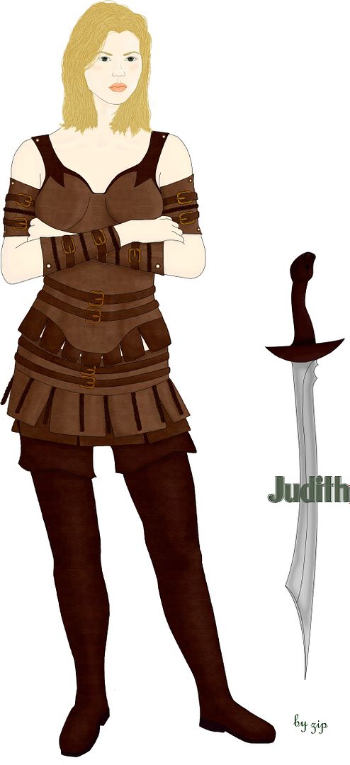
Ok. I added a sword, but after I finished it I accidently merged the whole thing.. so I can't edit the sword easily. But I'm happy with it as it is, so bah.
There's a bear head on the end of the hilt, it's hard to make out though. That's ok; this way I didn't have to draw it perfectly. Yay!
Now just to get it printed on shiny paper..
When you blur it all, how do you do that without it turning black around the edges?
___________________
Alright, I think I got it. How's this look?
Link
___________________
Ok. I added a sword, but after I finished it I accidently merged the whole thing.. so I can't edit the sword easily. But I'm happy with it as it is, so bah.
There's a bear head on the end of the hilt, it's hard to make out though. That's ok; this way I didn't have to draw it perfectly. Yay!
Now just to get it printed on shiny paper..
-
zipcat - Clan Member
- Posts: 1021
- Joined: July 4th, 2006, 1:09 pm
14 posts
• Page 1 of 1
Return to Titan Art Gallery & Polling Place
Who is online
Users browsing this forum: No registered users and 12 guests